
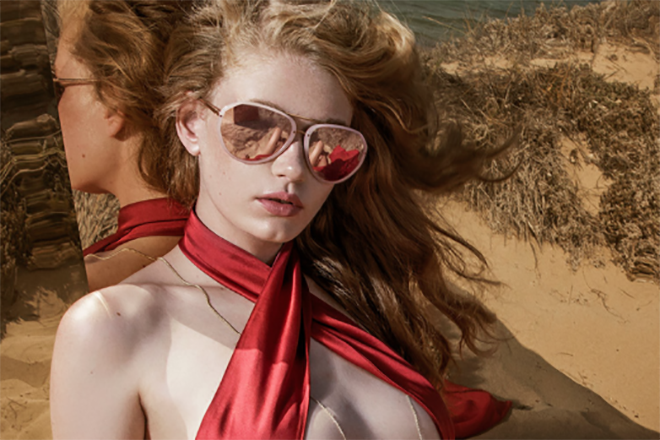
Pastel tones for a colorful spring
Did you know that one of the biggest trends for this season is pastel tones? Not only are the Pantone colors for 2016 the light blue called Serenity and the nude pink named Rose Quartz, but fashion designers are also using a soft, refined palette that will make its way into our wardrobes over the coming months.
Don’t be shy; add a touch of spring to your outfit. Even if you’re addicted to black, adding a dash of these ultra feminine tones is sure to uplift your look and your mood.
So, if you’re a fashion addict who is always one step ahead of what’s happening on the street, hurry up and choose your favorite pair of spring shades among these beauties we’ve selected for you.


DIOR SUN
COLOR: SLVMTPEAC (DK GREY) (RCM (BN))
CÉLINE 41399/S
COLOR: CHAMPAGNE (BROWN) (HAM (X7))
FENDI 0179/S
COLOR: AZRDPTTPD (BROWN AZURE) (TKV (E6))
MARC JACOBS 9/S
COLOR: GOLD BRGN (PINK BEIGE) (TZF (05))
LINDA FARROW BY MATTHEW WILLIAMSON 135
COLOR: CLEAR TO BLUE GRAD/ BLUE GRAD (C4)
JIL SANDER J3011
COLOR: BEIGE SMOKY GREY GRADIENT (A)
DOLCE & GABBANA 6104
COLOR: 304173
GIORGIO ARMANI 8068
COLOR: MATTE BLUE (54491G)
LINDA FARROW 136
COLOR: TEA ROSE/ LIGHT GOLD/ MARRON GRAD (C29)
PRADA 07RS
COLOR: OPAL DARK GREEN ON GREEN (TKQ4K1)
LINDA FARROW BY KHALEDA AND FAHAD 1
COLOR: LILAC GRADIENT/ LILAC/ LILAC GRAD (C17)
LINDA FARROW BY DRIES VAN NOTEN 100
COLOR: YELLOW/ OLD SILVER/ BROWN (C1)
LINDA FARROW BY MATTHEW WILLIAMSON 143
COLOR: CLEAR TO BLUE GRAD/ BLUE GRAD (C5)

